Key facts
- Founded
- 1991
- Founded by
- John Hennessey
- Country
- United States
- Headquarters
- Sealy, Texas, United States
- Legal name
- Hennessey Performance Engineering
- Famous models
- Venom GT, Venom F5, Venom 650R, Blackbird, VelociRaptor
- Website
- www.hennesseyperformance.com
Hennessey Performance Overview
Hennessey Performance Engineering was founded in 1991 by John Hennessey in Texas. The company operates from a 51,000 sq ft workshop and showroom in Sealy near Houston. It has grown into one of the most respected tuning companies with a main theme of high-performance tuning and record-breaking speed.
The brand started by modifying imports before making a focus shift to American muscle. Its milestones include the introduction of the Venom GT in 2010 and the car setting a record as the world’s fastest two-seater sports car at 270.49 mph in 2014. These achievements directly tie to the company’s reputation for pushing performance boundaries.
Hennessey Logo Evolution
2010 – 2021: Concentric Circular Emblem
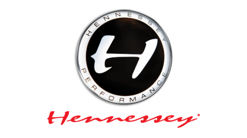
The Hennessey logo in this period was introduced in 2010 and used during the Venom GT record-setting run. It featured a layered concentric design that helped establish the brand during its rise in visibility.
- Design: Layered concentric emblem with outer band containing curved uppercase text and a central jet-black circle
- Colors: Monochromatic black and white with red italicized script
- Changes: Introduced alongside the Venom GT launch and the shift toward higher public recognition
- Context: Coincides with launch of the Venom GT and major record-breaking success in 2014
2021 – Today: Stylized Symmetric H with Arrows

Hennessey updated its visual identity in 2021 following years of performance achievements. The new Hennessey emblem adopts a cleaner more modern approach while maintaining connection to the brand’s core focus.
- Design: Bold symmetric emblem made of geometric shapes creating a stylized letter H
- Colors: Monochromatic with strong geometric contrast
- Changes: Transition from detailed circular emblem with text to simplified bold geometric mark
- Context: Occurs during brand maturation and expansion into electric vehicle modifications
The arrows pointing outward in the current Hennessey symbol represent expansion reaching boundaries and pushing performance limits. This aligns directly with the company’s ethos of high-performance tuning. The design conveys reliability solid foundation and contemporary appeal.
Hennessey logo history shows an overall evolution from a more ornate circular design to a confident streamlined mark. Both versions emphasize performance and speed in different visual ways. The 2010 era used fluid red script to suggest velocity while the 2021 version uses directional arrows to symbolize pushing limits.
The company continues its work on high-performance vehicles and electric modifications while maintaining its Texas roots. Its logo evolution reflects growing confidence and modernization as the brand expands its reach in the automotive performance sector.