
Key facts
- Years active
- 1955–1995
- Founded by
- Bianchi, Pirelli, Fiat
- Country
- Italy
- Headquarters
- Milan, Italy
- Parent company
- Fiat
- Legal name
- Autobianchi S.p.A.
- Famous models
- Bianchina, A112, Y10, Primula, A111
Brand Foundation
Autobianchi SpA was established in 1955 in Desio, Milan, by Giuseppe Bianchi, son of Edoardo Bianchi, after his father’s death in 1946. The company originated from the Bianchi bicycle and motorcycle business founded in Milan in 1885. Edoardo Bianchi had begun experimenting with motorized bicycles as early as 1897.
The new entity operated as a joint venture between Bianchi, Pirelli, and Fiat. Its sole purpose was dedicated automobile manufacturing, separate from the original Bianchi two-wheeled vehicle activities. Headquarters remained in Milan, Italy.
Early Bianchi heritage included a crowned eagle logo from the 1901-1940 period, followed by a circular logo with three Bs in 1945 and a single B in a triangle in 1948. These pre-Autobianchi designs provided visual context for the triangle motif that later became central to the Autobianchi emblem.
Corporate Timeline
The brand’s development included several major ownership changes that directly influenced its visual identity. Key milestones were the 1955 creation of Autobianchi SpA, the 1957 launch of its first model which introduced the initial logo, and the 1965 debut of new symbolism at the Paris Motor Show.
In 1968 the company was absorbed by the Fiat Group, prompting a significant redesign of the Autobianchi car logo. A collaboration agreement with Lancia began in 1985, leading to shared visual elements. Production ended in 1995 when the brand was merged into Lancia.
The parent company throughout the later years remained Fiat S.p.A. The evolution pattern of the Autobianchi logo moved from heraldic shield designs to minimalist typography, partnership symbols, and finally geometric abstraction.
Autobianchi Logo Evolution
1957-1959: Shield Era

This first Autobianchi logo was introduced with the launch of the Bianchina model. The design followed traditional heraldic styling common in Italian industry at the time. It established the triangle reference to the letter A that would appear in various forms throughout the brand’s history.
- Design: Shield shape featuring large A and B elements
- Colors: Not specified in historical records
- Changes: First dedicated logo separate from Bianchi bicycle identity
- Context: Created for the brand’s entry into automobile manufacturing
1959-1968: Text-Based Logo

The second logo marked a shift to pure typography without symbolic elements. This Autobianchi symbol used a formal and powerful style with black lettering. The interconnected letters created a unified wordmark that emphasized the full brand name.
- Design: Sans-serif geometric font with connected baseline
- Colors: Black lettering
- Changes: Removed all pictorial symbols in favor of text only
- Context: First logo to feature only the company name
1965-1968: Symbolism of Partnership
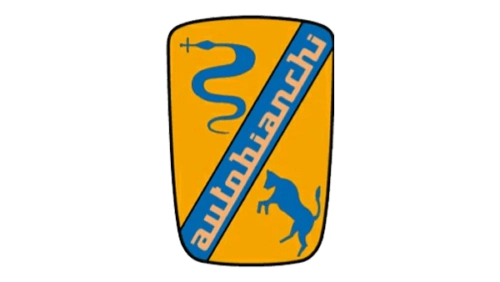
This short-lived but distinctive logo reflected the cooperation between Fiat and Pirelli. The Autobianchi car symbol placed silhouettes of a snake and jumping bull in opposite corners. A horizontal blue banner carried the company name in the same typeface as the previous text logo.
- Design: Snake and bull silhouettes with text banner
- Colors: Yellow background with blue banner
- Changes: Added symbolic representation of joint venture partners
- Context: Introduced with the second series of the Primula model at the Paris Motor Show
1968-1995: Geometric A Era

Designer Ilio Negri created this round Autobianchi emblem following the company’s absorption by the Fiat Group. A black triangle in the center featured one diagonal white line that created the illusion of a smaller triangle, forming a stylized letter A. This design served as the primary logo for nearly three decades.
- Design: Round circular border with central triangle A
- Colors: Monochrome black and white
- Changes: Replaced previous symbols with geometric abstraction
- Context: Introduced after Fiat absorption and used until production ceased
1977-1995: Full Name Variant
This typographic version placed a triangle in place of the letter A within the full brand name. The uppercase letters were thin and elegant, with spacing matched to the thickness of the round border from the primary emblem. It was used alongside the round geometric logo.
- Design: Triangle A substitution in full uppercase name
- Colors: Sophisticated monochrome
- Changes: Integrated the geometric A directly into wordmark
- Context: Served as a complementary logotype during the later period
1985-1995: Lancia Integration Era

Following the collaboration agreement with Lancia, the Autobianchi emblem received a rounded triangular border while keeping the central triangle intact. The logos often appeared together during this period. The stylized A was also incorporated into the Lancia shield in an inverted position.
- Design: Rounded triangular border with original central triangle
- Colors: Monochrome consistent with previous versions
- Changes: Modified outer shape to align with Lancia visual identity
- Context: Final evolution after Lancia collaboration agreement
Legacy of the Autobianchi Emblem
The triangle remained a recurring element in the Autobianchi badge from 1957 until 1995, representing the letter A across all major redesigns. This consistency provided continuity despite major corporate changes. The 1968 design by Ilio Negri became the longest-lasting version of the Autobianchi logo.
After the brand merged into Lancia in 1995, the distinct Autobianchi identity was discontinued. The logo evolution demonstrates how corporate ownership shifts directly influenced visual branding decisions throughout the company’s forty-year history. The various iterations remain important references for automotive logo history.