Key facts
- Founded
- 1901
- Founded by
- John Weller, John Portwine
- Country
- United Kingdom
- Headquarters
- Castle Donington, United Kingdom
- Legal name
- AC Cars (EU) Ltd
- Famous models
- Cobra, Ace, Aceca, 428
- Website
- ac.cars
Brand History
AC Cars Ltd., formerly known as Auto Carriers Ltd., traces its roots to 1901 when the Weller Brothers founded the company. Initially operating as Weller until 1904, the firm was renamed Autocars and Accessories that year and produced its first auto-carrier. By 1908 the company had officially adopted the AC name following the introduction of the A.C. Sociable passenger vehicle.
The headquarters were long located in Thames Ditton, Surrey, before the current AC Cars (EU) Ltd operation relocated to Castle Donington, Derby. Under current owner ACEDES Holdings, AC stands as one of the oldest British independent car makers with a continuous presence from 1901 to the present day.
Key milestones in the company’s development include the 1901 founding, the 1904 launch of the first auto-carrier, the 1907 creation of the original circular logo, the 1908 introduction of the AC name with the A.C. Sociable, the 1911 company move to Ferry Works in Thames Ditton coinciding with a major logo redesign, the 1954 addition of a temporary partnership element, the 1996 visual update, and the 2022 modernization of the brand mark.
Ac Logo Evolution
1907–1911: Original Logo
The first circular badge appeared in 1907 as a draft design even before the official AC name was fully established. This early emblem introduced the core roundel shape that has defined the brand for over a century.
- Design: Circular frame containing black AC letters with thick white outline and curved, dancing letterforms
- Colors: Black and white
- Changes: First use of the famous roundel shape
- Context: Created ahead of the 1908 launch of the A.C. Sociable model
1911–1996: Classic Green Era
A major redesign took place in 1911 that modernized the emblem while preserving the circular monogram form. This version became the longest-lasting and most iconic representation of the brand.
- Design: Medium-thick circular frame with fancy serif AC letters that do not touch the frame
- Colors: Dark moss-green letters and frame on light blue background
- Changes: Cleaned contours and more refined letter shapes
- Context: Coincided with the company move to Ferry Works in Thames Ditton
1954–1963: Bristol Variant
During a specific model and partnership period a temporary banner element was added beneath the circular badge. This variation maintained the core AC monogram while incorporating additional text.
- Design: Circular emblem with triple thin frame and enlarged white AC monogram plus arched banner
- Colors: Bright green circle with white lettering and banner
- Changes: Addition of arched banner containing extra text
- Context: Used during the 1954-1963 partnership period
1996–2022: 3D Blue Metallic Era

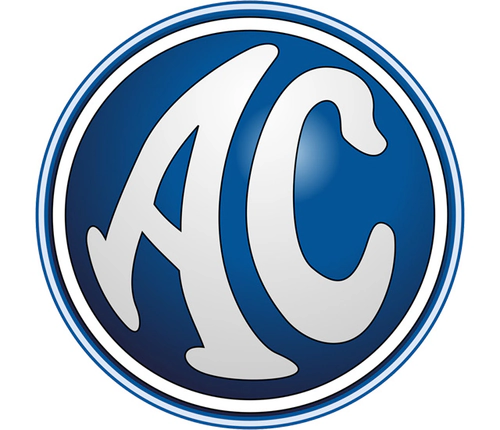
The brand refreshed its visual identity around 1996, shifting the color palette and adding dimensional effects while keeping the essential circular shape and monogram intact.
- Design: Thickened circular frame with emboldened white AC letters and three-dimensional shading
- Colors: Dark blue background with white lettering and metallic gradient
- Changes: Banner removed and complete shift from green to blue palette
- Context: Major modernization after decades of using the green version
2022–Present: Minimalist Flat Design
The most recent update in 2022 simplified the emblem further by removing gradients, multiple borders, and metallic effects in favor of flat, clean surfaces.
- Design: Simplified circular badge with clean lines and preserved original letter shapes
- Colors: Deep blue initials and border on solid white background
- Changes: Removal of gradients, shading, and extra borders
- Context: Current version reflecting stability and modern trustworthiness
Logo Design Characteristics
The core symbol of the AC logo has remained a circular badge containing the AC monogram since its introduction in 1907. The custom hand-drawn rounded serif typeface features thick smooth lines and arched silhouettes that give the letters a friendly yet confident appearance with no commercial equivalents.
Color choices evolved from the original black and white combination through various shades of green until 1996, after which the brand adopted blue and white. Green historically symbolized growth and success while the current blue palette represents reliability and trustworthiness. The design has seen remarkably few changes over 115 years, maintaining strong recognizability through its playful letter tails and consistent circular frame.
This ac logo history demonstrates how a simple roundel with a distinctive monogram can endure for more than a century while adapting to changing design trends. The ac car symbol continues to serve as an instantly recognizable mark for the British manufacturer.
Fans and collectors often search for ac logo png, ac logo transparent, and ac logo hd versions for reference and personal projects. High-quality ac logo images and ac logo download options make it easy to study the ac logo evolution across different eras.
The ac car logo has appeared on vehicles ranging from early touring cars to iconic sports models, while the ac emblem and ac badge remain central to the brand’s visual identity. For those interested in the ac logo meaning, it simply represents the initials of the company name that originated with the A.C. Sociable vehicle.