Key facts
- Founded
- 1941
- Country
- Russia
- Headquarters
- Ulyanovsk, Russia
- Parent company
- Sollers
- Legal name
- Ulyanovsky Avtomobilny Zavod
- Famous models
- 469, Patriot, Hunter, 452 (Bukhanka)
- Slogan
- “Обрети свободу движения”
- Website
- www.uaz.ru
UAZ Brand History
UAZ was founded in 1941 in Ulyanovsk, Russia. The company began as part of the Soviet war effort during World War II, producing military vehicles for the Russian army with no official logo in its earliest years.
A design office was created in 1954, marking the start of more independent manufacturing. This period coincided with the first major logo redesign. The brand became a joint-stock company in the 1990s following the dissolution of the Soviet Union. In 2000 ownership changed to Sollers JSC, which introduced a military-green and gray color palette along with Latin lettering.
Uaz Logo Evolution
1941–1954: Pre-Logo Period
- Design: No emblem used
- Colors: Not applicable
- Changes: First vehicles built without visual branding
- Context: Focused entirely on military production during World War II
1954–1957: Circular Emblem
- Design: Circular central part with two straight geometric wings, blue horizontal banner
- Colors: Intense red background, blue banner, thick yellow cursive Russian text
- Changes: First use of color and structured emblem design
- Context: Marked the beginning of independent manufacturing and brand identity development
1957–1959: Multiple Variants
- Design: Circular badge with thick frame and silver horizontal lines
- Colors: Light blue and silver
- Changes: Updated color scheme and simpler wordmark presentation
- Context: Transitional phase between the first colorful design and later geometric experiments
1959–1962: Triangular Arrow Emblem
- Design: Triangular top resembling an upward-pointing arrow, silver Russian wordmark inside
- Colors: Sky-blue with extra-thick silver outline
- Changes: Shift to more angular and unified geometric styling
- Context: Brief period of standardized logo design before the introduction of the core V symbol
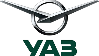
1962–1970 and 2016–Today: Iconic V on Circle
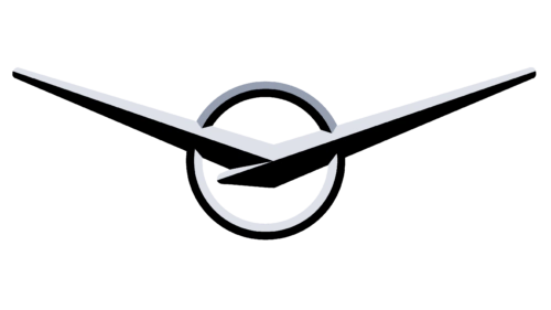
- Design: Thick sharp V bars spread wide on a small circle in a thin frame
- Colors: Metallic tones
- Changes: Return to 1962 design in 2016 with gloss and three-dimensional metallic look
- Context: The V symbol represents victory and serves as the primary Uaz emblem to this day
1970–2000: Blue Rectangle with Bird
- Design: Stylized silver bird with bent wing ends inside a rectangle
- Colors: Dark blue rectangle with thin silver outline
- Changes: Softer, more organic interpretation of the V symbol
- Context: Aimed to convey reliability, loyalty, and friendliness
2000–2016: V Plus Latin Inscription
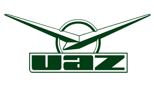
- Design: V on circle placed above massive outlined inscription
- Colors: Military-green and gray
- Changes: First and only version using Latin letters
- Context: Emphasized the brand’s military roots through color and typography choices
Uaz Logo Meaning and Symbolism
The core Uaz symbol is a simple metallic tick resembling an abstract geometric bird or sharp letter V with a widened base. This V represents victory and has remained the central motif since its introduction in 1962.
The stylized bird form used in some eras was derived from the original V design. Military green and gray tones introduced in 2000 reflect the brand’s origins in military vehicle production. The 2016 redesign returned to the classic 1962 V symbol while updating it with modern metallic finishes.
UAZ continues to use the refined 1962 V on circle as its primary logo, maintaining strong ties to its historical roots in Russian off-road and military vehicle manufacturing.