Key facts
- Years active
- 2003–2016
- Founded by
- Toyota Motor Corporation
- Country
- Japan
- Headquarters
- Torrance, California, United States
- Parent company
- Toyota Motor Corporation
- Famous models
- tC, xB, FR-S, xD, iQ
- Slogan
- “United by Individuality”
Brand Overview
Scion served as a division and youth-oriented marque under Toyota Motor Corporation. The brand was founded in 2003 and headquartered in Torrance, California, United States. Its name derives from the Old French word meaning descendant or heir, positioning it as a youthful extension of the Toyota family.
The marque primarily operated in the United States with a later expansion into Canada. Scion emphasized a futuristic and progressive identity aimed at younger drivers seeking stylish vehicles.
Brand History
Toyota initiated Project Exodus as the internal name for its new youth-focused marque that became Scion. This effort followed the earlier unsuccessful Project Genesis from 1999 to 2001.
The brand soft-launched at the New York Auto Show in 2002 with concept vehicles. Official launch occurred in the United States in 2003 with initial availability limited to California Toyota dealers starting in June 2003. Nationwide rollout across the United States took place between February and June 2004.
Scion reached its peak sales year in 2006. The brand expanded into Canada in 2010. It was discontinued on August 5, 2016 after the 2016 model year and fully absorbed back into Toyota.
Scion Logo Evolution
2003 – 2016: Primary Logo
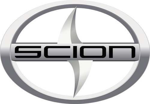
The Scion logo was created specifically for the new youth brand during Project Exodus. It remained consistent with no major redesigns throughout the marque’s entire lifespan from 2003 until discontinuation in 2016.
- Design: Stylized letter S enclosed in an oval frame with a horizontal thick line integrated with the wordmark
- Colors: Metallic-gray with three-dimensional appearance
- Changes: None documented during the active brand period
- Context: Developed concurrently with the overall brand identity by Fresh Machine and introduced at the 2003 launch
Fresh Machine, a Los Angeles and California-based design bureau, designed the Scion logo and brand identity. The emblem features a futuristic design with sharp shapes that convey strength, confidence, progressiveness, and creativity. Some interpretations see influences resembling West Coast watersports dynamism, a shark fin, or a road perspective.
The Scion car logo uses a custom sans-serif typeface for the word Scion with sleek bold lines and rounded angles. Sharpness stands out especially in the letter S, giving the font a dynamic and energetic quality that reflects movement. This Scion emblem maintained its blade or spaceship visual metaphor from launch through to the end of active use in 2016.
The metallic-gray 3D stylized S in oval served as the core visual trait of the Scion symbol. Combined with the wordmark, the overall logo presented an elegant, contemporary, future-centric, and youthful appearance. This design supported the brand’s positioning as a progressive descendant of Toyota.
Toyota created Scion in 2003 along with the introduction of the Scion logo. The single consistent visual identity ended with the brand’s discontinuation in 2016. The Scion badge reflected the marque’s focus on creativity and forward-thinking values throughout its history.