Key facts
- Founded
- 2014
- Founded by
- Chery Automobile Co., Ltd.
- Country
- China
- Headquarters
- Yibin, China
- Legal name
- Yibin Kaiyi Automobile Co., Ltd.
- Famous models
- Kunlun, Xuandu, Showjet, Shiyue
- Website
- kaiyihome.com
Kaiyi Brand History
Kaiyi was founded in January 2014 as a joint project between Chery and two state-owned investment funds. The brand initially operated internationally under the name Cowin from 2014 until 2022. In 2017 the investment funds withdrew, prompting Chery to restructure the company. The brand relocated to Yibin City in Sichuan Province, with construction of the Kaiyi production center completed in 2019.
The years 2020 to 2022 marked a period of transition away from the Cowin identity. In 2022 the company completed its official global rebranding from Cowin to Kaiyi, the international transliteration of its Chinese name 凯翼. Today the brand maintains independent operations with production based in Yibin, China.
Kaiyi Logo Evolution
2014–2022: Cowin Era
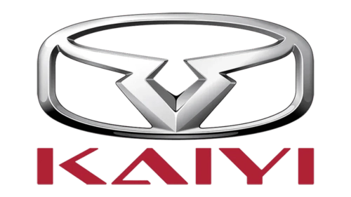
- Design: Three-dimensional abstract geometric figure resembling a Taurus head placed inside a rounded rectangular frame
- Colors: Red lettering combined with black background
- Changes: Distinctive pointed ends on some letter bars of the modern sans-serif typeface
- Context: Used from founding in 2014 through the 2017 restructuring and 2019 relocation to Yibin
2022–Present: Kaiyi Era
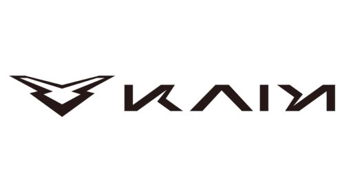
- Design: Sharper, more complete geometric symbol forming a closed contour with no additional framing
- Colors: Black lettering with glossy silver elements on solid white background
- Changes: Completely new futuristic geometric sans-serif typeface based on a heavily modified Bank Gothic Medium; stylized Y, both I letters, and removal of the horizontal bar of the A
- Context: Introduced with the official name change from Cowin to Kaiyi and preserves the brutal and sharp spirit of the original Taurus-derived emblem in a more progressive form
The visual continuity between both eras is intentional. The newer sharper geometric symbol maintains the core character of the earlier emblem while adopting a more contemporary and brutal aesthetic suitable for global audiences.
This logo history traces the brand’s development from its 2014 origins through corporate restructuring and relocation to its current independent position under the Kaiyi name. The evolution of the Kaiyi car logo reflects key milestones in the company’s journey toward a distinct international identity.