Key facts
- Founded
- 1958
- Founded by
- Bob Walklett, Ivor Walklett, Trevers Walklett, Douglas Walklett
- Country
- United Kingdom
- Headquarters
- Garforth, Leeds, United Kingdom
- Parent company
- LNT Group
- Legal name
- Ginetta Cars Limited
- Famous models
- G4, G50, G55, G60, Akula
- Website
- www.ginetta.com
Ginetta Brand History
Ginetta Cars Limited was established in 1958 by the Walklett brothers Bob, Ivor, Trevers and Douglas. The company began operations in Woodbridge, Suffolk and later relocated several times, moving to Witham in Essex in 1962, operating from Sudbury in Suffolk between 1972 and 1974, and then expanding to Scunthorpe in 1988.
In 1989 the Walklett brothers sold the business to an international group led by Martin Phaff. The company experienced financial difficulties during this period before being acquired by Lawrence Tomlinson and the LNT Group in late 2005. Following the acquisition the headquarters moved to a factory near Leeds in mid-2007. Subsequent milestones include the 2010 acquisition of Farbio Sports Cars, the 2017 purchase of Blyton Park test circuit, and the 2021 launch of the G56.
The specialist builder maintains its focus on performance, innovation and nurturing young racing talent through series such as Ginetta Junior, GT4 and GT Supercup.
Ginetta Logo Evolution
1958–1989: Original Ginetta Logo
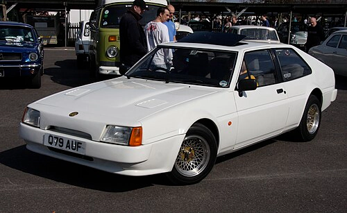
- Design: Distinctive G symbol combined with elegant typography and clean lines
- Colors: Typically rendered in metallic or monochrome finishes suitable for racing livery
- Changes: Established the original brand mark tied to early G-series vehicles
- Context: Used while the company operated under Walklett ownership from its base in Woodbridge through subsequent headquarters moves
The Ginetta symbol from this period embodied British sports car heritage and performance focus.
1989–2005: Transitional Ginetta Logo
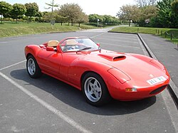
- Design: Core Ginetta wordmark with minor adjustments to typography
- Colors: Consistent with previous era to preserve visual equity
- Changes: Subtle refinements rather than complete redesign
- Context: Applied during a period of transition and operational challenges
This approach to the Ginetta car symbol helped protect brand recognition through uncertain years.
2005–Present: Modern Ginetta Logo

- Design: Clean, bold sans-serif typography with prominent G symbol emphasizing speed
- Colors: Black, white, or metallic silver and red color schemes
- Changes: Simplified and more contemporary appearance compared to earlier variants
- Context: Rolled out across new racing series and modern vehicle range after the 2007 move to Leeds
The updated Ginetta emblem reflects the company’s repositioning as a forward-looking racing manufacturer.
Ginetta Logo Meaning and Symbolism
The letter G has consistently represented both the brand name and the G-series of vehicles throughout Ginetta logo history. This creates a strong visual connection between corporate identity and product lineage that persists across all eras of the Ginetta badge.
Ginetta logo evolution mirrors key ownership changes and the company’s enduring British motorsport heritage. From the founding by the Walklett brothers through to current ownership by Lawrence Tomlinson, the Ginetta car logo has adapted while retaining its core symbolism of performance and racing excellence.
The modern Ginetta symbol appears on vehicles, racing liveries and official materials, reinforcing the brand’s specialist status in the industry.