Key facts
- Founded
- 2009
- Founded by
- Neill Briggs, Ian Briggs
- Country
- United Kingdom
- Headquarters
- Liverpool, United Kingdom
- Legal name
- Briggs Automotive Company (BAC) Limited
- Famous models
- Mono, Mono R
- Website
- www.bac-mono.com
Brand History
Briggs Automotive Company was established in 2009 by Neill Briggs and Ian Briggs. The company started with 20 employees at its headquarters in Speke, Liverpool, United Kingdom. BAC focuses on high-performance racing cars and supercars, with its primary product association being the Mono model.
The brand launched officially in 2009 alongside its visual identity. The Mono model followed in 2011, marking the company’s first major product release. Since then, BAC has continued operations under the same name and ownership structure, expanding its reach globally.
Bac Logo Evolution
2009 – Present: Minimalist Geometric Era
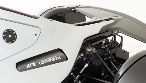
The BAC emblem and logotype were created and introduced in 2009 at the exact time of the company’s founding. This design has remained unchanged through the Mono launch in 2011 and all subsequent years of operation. The stable identity reflects the brand’s focused positioning in the high-performance automotive sector.
- Design: Two-part identity consisting of a graphical emblem and custom logotype
- Colors: Monochrome black on white background
- Changes: No redesigns or variants introduced since 2009
- Context: Created to match the high-performance racing character of the new company
The graphical element features an abstract composition of two diagonal lines forming a stylized figure resembling the number 1. The left diagonal is twice as thick as the right one, with the right angle rounded and the left bar cut straight. This structure uses three elements that mirror the three letters of BAC.
The diagonal lines in the bac car logo represent speed, motion, and freedom while the stylized 1 conveys a winning mood and competitive spirit. These choices directly support the brand’s racing and high-performance positioning. The bac symbol is often used standalone or to replace the B in the Mono nameplate.
BAC selected a custom uppercase sans-serif typeface for its logotype. The design features smooth lines mixed with softened and sharp angles, giving it a dynamic and energetic appearance. This logotype is likely inspired by fonts such as Babylon Smooth and BD Telegraph.
The monochrome choice for the bac emblem emphasizes quality, precision, professionalism, and stability. A white background conveys protection and trustworthiness. These visual decisions align with the company’s identity as a specialist manufacturer of performance vehicles.
The bac badge maintains its original form across all applications. Its abstract design ties the visual identity to the three-letter brand name while communicating core values of motion and victory. This consistency has helped establish strong brand recognition since the company’s inception.
BAC vehicles and official materials have used this same logo without alteration. The enduring design demonstrates the effectiveness of the original 2009 concept created by the founders. The bac logo history shows a deliberate choice for timeless minimalism over frequent updates.