Key facts
- Years active
- 1959–2007
- Founded by
- Jem Marsh, Frank Costin
- Country
- United Kingdom
- Headquarters
- Kenilworth, United Kingdom
- Legal name
- Marcos Engineering Ltd
- Famous models
- Mini Marcos, 1800 GT, Mantula, Mantis, LM600
- Website
- marcos-eng.com
Brand Overview
Marcos was established in 1959 by Jem Marsh and Frank Costin as a British sports car manufacturer. The company operated from its headquarters in Kenilworth, England, focusing on innovative engineering and distinctive design in the production of high-performance sports cars. Its core identity remained centered on quality and performance until the company ceased operations and entered voluntary liquidation on 9 October 2007.
Marcos Logo Evolution
1959–2007: Original / Classic Marcos Logo
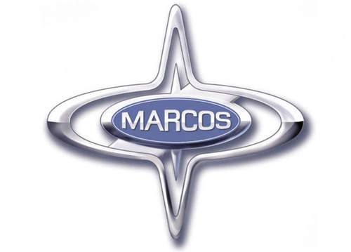
The primary Marcos logo was introduced at the company’s founding in 1959 and remained in use throughout its history. This design served as the main visual identity for the brand during decades of sports car production.
- Design: Horizontally stretched oval with two thin triangles extending from top and bottom creating a four-pointed star silhouette, silver outline, inner smaller oval, custom square sans-serif typeface with rounded angles
- Colors: Bright blue inner oval background with glossy silver lettering
- Changes: Each letter of MARCOS scaled differently to follow the curved contour of the ellipsoid banner
- Context: Created as part of company founding by Jem Marsh and Frank Costin with name origin directly reflected in the central lettering
1959–2007: Red Stripe Variant

A secondary Marcos emblem was used alongside the primary version during the company’s operational years. This variant maintained the same fundamental geometry while introducing different background elements.
- Design: Same oval and star shape with central blue oval containing silver MARCOS lettering, thick red diagonal fragment crossing the field
- Colors: Glossy white main background, red stripe, blue inner oval, silver lettering
- Changes: Minor background and color modifications only with core symbolic elements remaining untouched
- Context: Provided an alternative presentation of the Marcos car symbol while preserving brand recognition across multiple model releases
The Marcos logo meaning derives directly from the founders’ surnames, making the central lettering both a brand name and a symbolic representation of its creators. This consistent visual approach helped maintain brand identity despite changes in the automotive landscape.
Throughout its history the Marcos badge showed remarkable stability with only background variations appearing between the primary blue and silver design and the white and red alternative. The horizontally stretched oval combined with the four-pointed star silhouette created a distinctive Marcos car logo that enthusiasts still recognize today.
When seeking reference materials many look for Marcos logo hd or Marcos logo png versions to study the typography and geometric details more closely. The silver custom lettering against the blue field remains the most recognizable form of the Marcos emblem from the brand’s active years.