Key facts
- Founded
- 1959
- Founded by
- Sir Alec Issigonis
- Country
- United Kingdom
- Headquarters
- Oxford, United Kingdom
- Parent company
- BMW Group
- Famous models
- Cooper, Countryman, Clubman, Aceman, Convertible
- Website
- www.mini.com
Brand History and Overview
MINI originated in 1959 under the British Motor Corporation with the goal of providing affordable small cars to the British public. The brand was founded by Alec Issigonis and began as two separate lines, the Morris Mini Minor and the Austin Seven. Over the following decades ownership changed through British Leyland and the Rover Group until BMW completed its acquisition in 2000 and has owned the brand since 2001.
Key milestones tied directly to logo changes include the 1961 introduction of the Mini Cooper by John Cooper, the 1969 standardization under the Rover Group, the 2001 modernization after the BMW purchase, and the 2018 refinement of the current design.
Mini Logo Evolution
1958–1962: Pre-Standardization Period
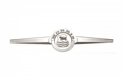
- Design: Separate circular and coat-of-arms styles
- Colors: Varied by manufacturer
- Changes: No single brand identity
- Context: Dual production under British Motor Corporation before 1962
1962–1969: Cooper Era Introduction of Wings
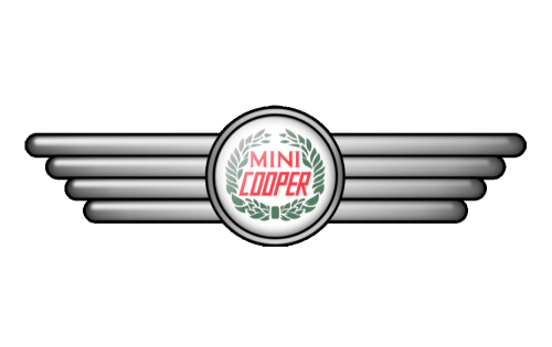
- Design: Circular badge with large squared wings
- Colors: Silver circle, red lettering
- Changes: Wings introduced for the first time
- Context: Tied to the successful Mini Cooper model during 1962-1969
1968–1969: Minimalist Transitional Logo
- Design: Black circle with serif typography and outlined wings
- Colors: Black and white
- Changes: Shorter wings and simplified form
- Context: Bridge between Cooper era and Rover Group standardization
1969–2001: Hexagon Era
- Design: Symmetrical hexagon divided horizontally
- Colors: Black, white, turquoise and silver
- Changes: Major shift to geometric shape with high contrast
- Context: Used consistently for over thirty years under Rover Group ownership
2001–2018: BMW-Era Winged Logo
- Design: Circular emblem with prominent sharp wings
- Colors: Multiple shades of black and silver
- Changes: Revival of winged motif with metallic 3D styling
- Context: Created after BMW purchase and used until 2018
2018–Present: Monochrome Refinement
- Design: Laconic flat emblem with straight bold wing lines
- Colors: Monochrome black, white and silver
- Changes: Switch from 3D metallic to flat 2D design
- Context: Current MINI logo under BMW ownership
Symbolism and Design Philosophy
The wings in the Mini logo have consistently symbolized freedom, speed, swiftness and strength across all eras. The circle element balances the sharp geometry of the wings and represents unity and completeness.
Color choices evolved from early multi-color versions through metallic black and silver to the present monochrome scheme. The overall brand philosophy emphasizes a youthful spirit, focus on design, free spirit, elegance and strength.
This Mini logo history reflects six decades of corporate transitions while maintaining recognizable core visual elements from the original Cooper era through to the current BMW-owned MINI. The Mini car symbol continues to represent the brand’s distinctive character in automotive design.