Key facts
- Years active
- 2008–2019
- Founded by
- Changan Automobile Co., Ltd.
- Country
- China
- Headquarters
- Chongqing, China
- Parent company
- Changan Automobile
- Famous models
- Star, Star S460, Taurustar, CX70
Brand History
Changan Automobile Group, also referred to as Chang’an, was founded in 1862 in Chongqing, China. The company began as a state-run ordnance factory producing military equipment. It later entered automotive manufacturing and is now the third-largest Chinese automaker operating as a government-controlled subsidiary of China South Industries Group.
The brand variants include Chang’an and Chana, with the latter used as a distinct sub-brand. The name Changan translates to enduring security in Chinese. This core meaning influenced early branding that emphasized protection and safety.
Chana Logo Evolution
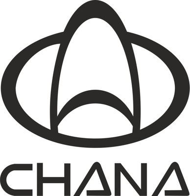
1957 – 1998: Dual Arch in Red Oval

The first automotive-era logo appeared after the company transitioned from military production. Dual arch rising in a curve created four ivory voids separated by red lines of varying shapes.
- Design: Dual arch enclosed in oval with black uppercase letters
- Colors: Red, black, ivory white, gray tones
- Changes: First passenger-vehicle logo following shift from ordnance manufacturing
- Context: Represented the brand’s initial move into car production with symbolism tied to enduring security
Chana logo history begins with this era that established the foundational arch motif still recognizable in later designs.
1998 – 2010: 3D Gray Arches with Blue Text

This period retained the arch contour but introduced broadened stripes with three-dimensional shading and highlighting on gray tones. The oval shape was also widened to accommodate the updated elements.
- Design: Broadened arch stripes with 3D shading and new letter shapes
- Colors: Blue lettering, gray 3D shading, red oval retained
- Changes: Complete typography redesign featuring chic curvy slanted letters
- Context: First major modernization of the original arch symbol while keeping core identity
The Chana emblem during these years reflected a move toward more contemporary styling while preserving historical continuity.
2010 – 2019: V Symbol in Rectangle and Round Variants

Multiple refinements occurred during this timeframe. The 2010-2013 version used a rectangular emblem with thick silver border and dark blue background featuring a stylized silver metallic V surrounded by chain-link pattern. The 2013-2016 update shifted to circular shape with bolder V on gradient blue background. By 2016-2019 the design transformed into an inverted arch forming broad V resembling wings within a ring-like figure.
- Design: Stylized V in rectangle then round shapes with evolving frame treatments
- Colors: Blue, silver, gradient backgrounds
- Changes: Progressive shift from rectangular to circular to winged V forms
- Context: Movement toward global identity with V representing both victory and value
This Chana car symbol period marked significant evolution as the brand expanded internationally and reduced use of Chinese characters in favor of Western lettering.
2019 – Present: Minimalist Blue Wings Design

The current era features solid blue background with simplified V without complex chain design. Extraneous embellishments were removed while retaining the core V, trapezoidal frame, and double border in contemporary 2D flat style.
- Design: Minimalist uninterrupted ring with smoother metallic texture
- Colors: Deep blue and white primary colors
- Changes: Removal of 3D effects, gradients, and extra patterns for flat design
- Context: Reflects brand maturation, global recognition needs, and focus on electric vehicle era
Chana logo meaning is most clearly expressed in this version where enduring security pairs with victory and value symbolism in clean modern form.
Design Elements Summary
The Chana badge evolved through four distinct eras with clear progression in style and meaning.
- 1957–1998 used dual arch in oval with red black and ivory colors
- 1998–2010 introduced 3D effects while keeping red oval
- 2010–2019 focused on V symbol for victory and value with blue and silver
- 2019–today employs minimalist flat design in deep blue and white
This Chana logo evolution mirrors the company’s journey from military factory to innovative automaker emphasizing sustainability and new energy vehicles. The brand maintains consistent ownership under China South Industries Group throughout all periods.
Chana symbol continues to represent the enduring security of the original name while incorporating modern victory and value concepts. The current minimalist approach supports international operations in over 60 countries and aligns with industry trends toward simplicity.
Users seeking visual references can explore Chana logo hd versions and Chana logo transparent background files in our logo catalog. Chana png and Chana logo images provide clear views of each era’s distinct characteristics.
The Chana car logo has transformed significantly since its first automotive appearance while preserving recognizable arch and V elements across decades of change.